Monday, 20 October 2014
Tuesday, 25 February 2014
N tunes Records-Print Promotion
The Album
I chose to keep the face of the artists hidden to add suspense and build a sense of anticipation as to who they are due to the fact that they're a new and upcoming pop-rock band. The sheen of light coming through conveys that they're new and fresh. The album is called "The Beginning" which also ties n with the tour. The representation of their music are shown through the guitar and the drumsticks.
The Tour Dates
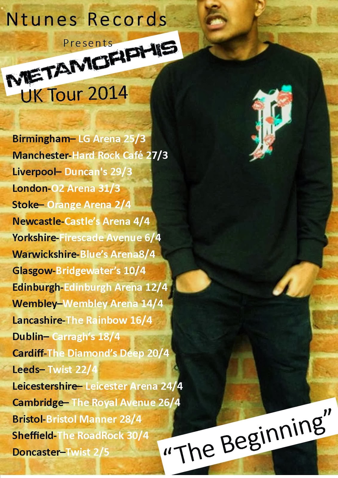
I've also, again, kept the faces hidden but this time to keep up anticipation to actually see them at the tour. It also shows how without having to see the face you can recognize who each person is due to the amount of fame they have achieved. The style of each poster is identical except for the actual image, even the images are similar in how its took to show that they are from the same band. The change of colors for each poster also change depending on the different person in the picture to represent them.
green
yellow
pink
Leaflet/Flyer
In this flyer I have advertised the bands name by putting their band name bang in the middle. It is slanted to show their rebellious and loud sound as the slant gives an appearance of it being slammed onto the poster. The background picture is of the band, but i faded it and blurred it so it doesn't take away from the words and they're visible.
Subscribe to:
Comments (Atom)


